If your nonprofit marketing isn't working, the problem is probably structure — not effort.
Most nonprofits trying to grow their marketing program aren't failing because of a lack of commitment. They're failing because the pieces don't connect.
A blog post goes out. An email gets sent. A social media account gets updated. Each one is well-intentioned. Some are even well-executed. But they exist in isolation — disconnected from each other, disconnected from the CRM, disconnected from any system that would let them compound over time.
That's not a marketing problem. That's an architecture problem.
The organizations that build consistent visibility, growing audiences, and marketing programs that produce real results aren't working harder. They're working inside a system. One where content attracts the right audience, HubSpot automates the journey, and data tells them what to do next.
That system is what Yodelpop calls the Connected Marketing System.
Why Nonprofit Marketing Often Feels Harder Than It Should
Nonprofits have something most commercial organizations don't: a genuine mission. Educational content. Real expertise. Stories that matter. Credibility that isn't manufactured.
That should make marketing easier. Often it doesn't — because the assets exist but aren't organized.
The patterns we see most often:
Content without a strategy. Blog posts written when someone has time, on topics that seemed relevant at the moment, with no connection to a larger content architecture. Traffic stays flat because no single page has enough authority to rank, and no cluster of content signals expertise to search engines or AI engines.
HubSpot without a plan. The portal exists. Contacts are in it. But lead capture is incomplete, lifecycle stages aren't configured, automation sequences aren't running, and reporting doesn't connect content performance to pipeline. HubSpot becomes an expensive email tool instead of the operational backbone it should be.
Effort without compounding. Every campaign starts from scratch. Every quarter feels like rebuilding. There's no flywheel — no system where this month's content feeds next month's leads, and last year's pillar page is still generating traffic and conversions today.
The issue isn't a lack of talent or commitment. It's a lack of cohesion.
Content without a system is just publishing. HubSpot without a content strategy is just software. The Connected Marketing System is the bridge.
What the Connected Marketing System Is
The Connected Marketing System is Yodelpop's core methodology — built, proven, and refined over 15 years of real client work with nonprofits and mission-driven organizations.
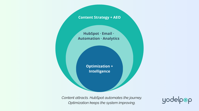
It has three interdependent layers that work together as a flywheel:
Layer 1 — Content Strategy and AEO Content planned, structured, and optimized to attract the right audience through both traditional search and AI-generated answers.
Layer 2 — HubSpot Operations HubSpot configured as the operational backbone — automating the buyer journey, capturing and nurturing leads, and closing the loop between content performance and pipeline.
Layer 3 — Optimization and Intelligence Ongoing tracking, content refresh, and AEO monitoring that keeps the system improving over time.
Most organizations have pieces of this. Almost none have it connected. That's the gap the Connected Marketing System fills — and the gap that separates nonprofits whose marketing compounds from those whose marketing stalls.
Layer 1 — Content Strategy and AEO
Content is the foundation of everything. It's how people find your organization, how they learn to trust you, and how they move from awareness to action.
But content only works when it's structured. Random publishing — even high-quality publishing — doesn't compound. Structured content does.
Topic Clusters and Pillar Pages
The Connected Marketing System organizes content into topic clusters — a pillar page at the center covering a core subject, supported by a set of blog posts addressing specific questions and subtopics within that theme.
This architecture does two things simultaneously:
It tells search engines that your organization is an authoritative source on this topic — not a one-time publisher. And it gives your audience a complete resource — wherever they enter your content, they can find everything they need.
Most organizations have pieces of this. Almost none have it connected. That's the gap the Connected Marketing System fills.
For nonprofits, topic clusters are built around the subjects most central to your mission and your audience's most pressing questions. A senior care organization might build a cluster around dementia care. A youth mental health nonprofit might build one around evidence-based approaches to adolescent anxiety. The topic cluster makes your expertise findable and credible.
AEO — Answer Engine Optimization
Search has changed. AI answer engines — ChatGPT, Google's AI Overview, Perplexity, Microsoft Copilot — are now where a growing share of your audience begins their research. These tools don't return a list of links. They synthesize an answer and cite the sources that informed it.
If your content isn't structured to be cited, it is invisible in that conversation.
Answer Engine Optimization (AEO) is the practice of creating and structuring content so that AI answer engines can find it, understand it, and cite it. It builds on traditional SEO but goes further — optimizing for how AI synthesizes answers, not just how humans click on results.
Nonprofits are uniquely positioned to win at AEO. The criteria AI engines use to evaluate credibility — Experience, Expertise, Authoritativeness, and Trustworthiness (EEAT) — map almost perfectly to what mission-driven organizations already do. You have the firsthand experience, the subject matter expertise, the organizational credibility, and the trust signals that AI engines look for.
The problem, again, isn't credibility. It's structure.
All content created within the Connected Marketing System is AEO-native by default — written and structured to perform in both traditional search and AI-generated answers from the first draft.
Go deeper on AEO:
How Nonprofits Get Found in AI Search Results →
The Buyer Journey
Content within the Connected Marketing System is mapped across the full buyer journey — awareness, consideration, and decision stages — for each persona your organization serves.
Awareness content brings new audiences in. It answers the questions people are asking before they even know your organization exists. It ranks in search and gets cited in AI answers.
Consideration content educates. It helps people understand your approach, your methodology, and why it works. It builds trust and deepens engagement.
Decision content converts. It speaks to people who are ready to take action — to donate, volunteer, enroll in a program, or engage your services. It removes friction and makes the next step clear.
When content is planned across all three stages for each persona, marketing stops being reactive and starts being strategic. You know what to create, why, and for whom.
Layer 2 — HubSpot Operations
Content brings people to your organization. HubSpot is what happens next.
A properly configured HubSpot portal is not a CRM. It is the operational backbone of your entire marketing and development program — the system that automates the buyer journey, tracks every interaction, and closes the loop between content performance and pipeline.
What HubSpot Does in the Connected Marketing System
Lead capture and segmentation Forms, popups, and landing pages connected to HubSpot capture contacts at every conversion point. Contacts are segmented by persona, lifecycle stage, and engagement — so communication is always relevant.
Lifecycle stage automation Contacts move through lifecycle stages automatically based on their behavior — from subscriber to marketing qualified lead to sales qualified lead — without manual intervention. The system works while your team focuses on mission.
Email nurture sequences Automated email sequences aligned to buyer journey stage and persona deliver the right message at the right moment. A new subscriber who found you through an AEO-cited blog post receives different content than a longtime donor who downloaded a research report.
Reporting dashboards HubSpot dashboards close the loop between content performance and pipeline — showing which pillar pages are generating the most leads, which nurture sequences are converting, and where the gaps are. This is what makes optimization possible.
HubSpot for Nonprofits
HubSpot implementation for nonprofits is different from B2B implementation. The buyer journey is different. The personas are different. The conversion goals are different. Configuring HubSpot correctly for a nonprofit requires understanding both the platform and the sector.
Yodelpop is a certified HubSpot Solutions Partner with over 15 years of experience implementing HubSpot exclusively for nonprofits and mission-driven organizations. Every implementation is built around the Connected Marketing System — not just as a standalone CRM project, but as the operational backbone of a complete marketing strategy.
Explore HubSpot for nonprofits:
HubSpot for Nonprofits: How to Build a Scalable CRM System →
Layer 3 — Optimization and Intelligence
The Connected Marketing System is not a project. It is a program — one that improves continuously as data accumulates and the strategy matures.
Layer 3 is what keeps the system aligned and improving over time.
AEO Performance Tracking
As AI search continues to evolve, monitoring whether your content is being cited — and in response to which queries — is an increasingly important part of content strategy. Yodelpop conducts biannual AEO performance reviews, manually querying AI answer engines with the questions your audience is most likely to ask and tracking which content is cited and what's missing.
Content Refresh and Expansion
Content that performed well three years ago may need structural updates to perform in today's search environment. Outdated statistics, missing AEO formatting, and broken internal links are all signals that reduce credibility and visibility. A systematic content refresh cadence keeps the asset base current and competitive.
Ongoing Content Planning
The Connected Marketing System runs on a content calendar that is driven by data — not by what someone has time to write this week. Monthly reporting on organic entrances, AI citation mentions, email engagement, and pipeline contribution informs what gets created and optimized next.
Building Your Nonprofit Marketing Strategy
A nonprofit marketing strategy built on the Connected Marketing System has a clear sequence. Each step builds on the one before it.
Step 1: Define your audience and buyer journey
Who are you trying to reach? What questions are they asking at each stage of their journey with your organization? What actions do you want them to take?
This is where persona development and buyer journey mapping happen — the work that makes every subsequent content and HubSpot decision faster and more effective.
Step 2: Build your topic cluster architecture
Based on your personas and buyer journey, identify the 2–4 core topics your content program should be built around. For each topic, plan a pillar page and 5–8 supporting cluster blog posts.
This is the content architecture that tells search engines and AI engines you are the authority on the subjects that matter to your audience.
Step 3: Configure HubSpot as the operational backbone
Map your HubSpot configuration to your buyer journey — lead capture, lifecycle stages, segmentation, automation sequences, and reporting dashboards. Connect your content to your CRM so every conversion is tracked and every contact is nurtured.
Step 4: Publish and optimize for AEO
Create your pillar pages and cluster blog posts using AEO-native structure. Write for AI citation from the first draft. Ensure every piece of content has visible EEAT signals — author credentials, data citations, real outcomes.
Step 5: Distribute and amplify
Your email list and LinkedIn presence are distribution channels for the content system — not standalone strategies. Every pillar page launch, every cluster blog post, every AEO content update is a content asset that gets distributed through email and social media to compound its reach.
Step 6: Measure, optimize, repeat
Monthly reporting drives the next round of content decisions. What's ranking? What's being cited? What's converting? What needs to be refreshed? The system improves because the data tells you what to do next.
What Success Looks Like
Organizations that implement the Connected Marketing System consistently see:
Compounding organic traffic — pillar pages and topic clusters that continue to generate traffic and leads months and years after they're published, without additional investment.
AI citation visibility — content that gets cited in AI-generated answers to the questions your audience is asking, driving high-intent traffic from people who've already received a synthesized answer and want more.
HubSpot attribution — clear visibility into which content pieces and conversion points are generating the most pipeline, so marketing investment is directed where it produces results.
Sustainable execution — a content calendar that runs on a system, not on whoever has time this week. Marketing that doesn't fall off when a team member leaves or a quarter gets busy.
Flywheel growth — as the system matures, the flywheel accelerates. Content drives traffic. Traffic generates leads. Leads become clients or retainer relationships. Case studies from client work feed the content system. The system finds new audiences. No cold outreach required at any stage.
Getting Started
The Connected Marketing System is built in stages. You don't need to have everything in place before you start seeing results — you need to start in the right order.
If you're starting from zero: Begin with your content mission and your first topic cluster. Get one pillar page live, write four supporting blog posts, connect them with internal links, and configure basic HubSpot lead capture. That's a functional, compounding marketing asset from day one.
If you have existing content: Start with a content audit. Map what you have to your topic cluster architecture. Identify your highest-traffic pages and optimize them for AEO. Fill gaps with new cluster content. Connect everything with internal links. Build the HubSpot configuration that captures and nurtures the leads your content is already generating.
If you want the full system designed for you: The Nonprofit Marketing Gameplan is Yodelpop's comprehensive strategic engagement — a complete Connected Marketing System designed specifically for your organization. It maps your full buyer journey, topic cluster architecture, HubSpot configuration roadmap, AEO strategy, email nurture plan, and reporting framework in one focused engagement.
It is the entry point for all Yodelpop retainer relationships — and the fastest path from disconnected marketing efforts to a system that compounds.
Ready to map your Connected Marketing System?
Download the free Connected Marketing System Planner — a three-section workbook to assess where your marketing stands, map your audience and buyer journey, and design your content, HubSpot, and AEO architecture.


 Camille Winer Founder & CEO, Yodelpop
Camille Winer has been building marketing systems for nonprofits and associations since 2004 — first as an independent consultant, then as founder of Yodelpop, the certified HubSpot Solutions Partner she has led since 2011. Over more than two decades, she developed the Connected Marketing System: the methodology behind everything Yodelpop does.
Camille holds an MBA with a focus in sustainability and brings deep expertise across web development, content strategy, HubSpot implementation, and AEO-native content marketing. She is one of the earliest practitioners of Answer Engine Optimization for the nonprofit sector.